Building a botanical wellness brand from the ground up.
Doctor-formulated herbal supplements from Cape Town — named, branded, packaged and launched online.
OxiBotanica is a South African wellness brand founded by a registered homeopath. We built the identity from the ground up — name, logo, packaging, website and product visuals.
Nothing was locked in when we started: the name, the product range and the website were worked out alongside the identity. The founders knew natural medicine, not branding, so every decision was talked through in plain terms.
Finding the balance between science and nature.
The positioning was "science meets soul": credible enough to trust, warm enough to feel personal. Most wellness brands land on one side — a pharmacy, or "organic" pushed so far it reads as handcrafted and small.
- Avoid the pharmacy look
- Avoid handcrafted organic clichés
- Leave room for a growing range
A name that keeps Oxi and says what it does.
We explored the name and early marks together. Some kept the existing "OXI" as an anchor, others pushed further out — OxiRoots was one — before we landed on OxiBotanica.
It kept the recognition of "Oxi" and said what the brand does. We weighed OXI Botanica against OxiBotanica: camel case felt more modern and personal, and "Oxi" still works as a prefix for the range — OxiCalm, OxiMune, OxiThrive.
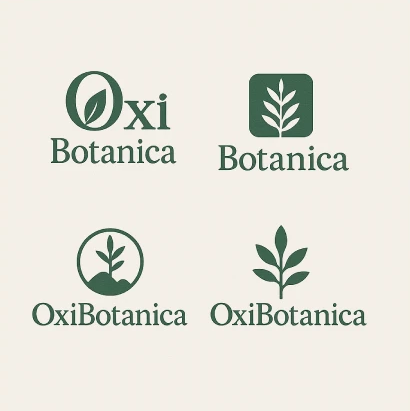
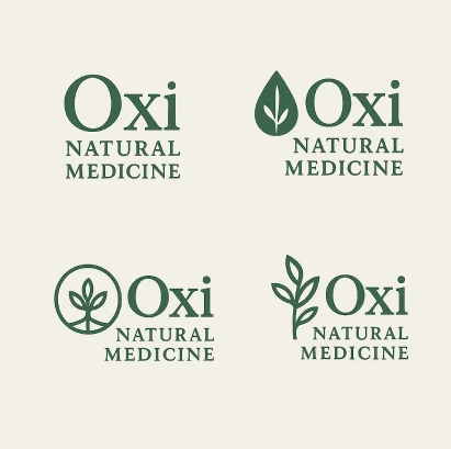
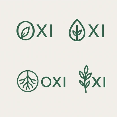
Exploring different personalities.
Once the name was locked, we focused on two icon directions. The first was the Vital Leaf — clean, simple, representing botanical ingredients and growth. It worked fine digitally but felt a little too familiar for the wellness space; you've seen that leaf before.
The second was the Breath Tree, drawn from the wind-shaped trees of the Cape coast and standing for growth and vitality.


”The tree's silhouette subtly resembles a penguin — an unexpected detail that ties the brand back to South Africa without ever being literal about it. So the Breath Tree became the mark: rooted in a real Cape landscape, with a second reading we never planned.
Refining the system.
With the direction chosen, we spent time refining proportions, spacing and the different lockups. We tested the logo across formats — from standalone icon to full wordmark — to make sure it held up as well on a packaging label as it would on the website, social, or a tiny app icon.

Keeping the typography simple.
The icon already carried a lot of personality on its own, so we wanted the typography to do the opposite — support the identity rather than compete with it. It just needed to bring warmth, stay readable, and feel a bit editorial.
Greens that feel grown, not clinical.
Deep forest green carries the brand. Sage, mint and olive soften it, clay and sand bring warmth to the packaging, and text stays in warm, near-black tones instead of pure black.
Deep Forest Green
#2F5D3ALogo, strong icons, buttons
Soft Sage Green
#B7C2A8The main calming green
Fresh Mint
#A7D3A6Lighter icons, gentle highlights, subtle callouts
Olive Green
#6E7F52Adds herbal depth
Clay Brown
#A97C50Warmth for earthy packaging touches
Warm Sand
#D8C4A0Section backgrounds, hover states, subtle dividers
Warm Linen White
#F8F6F2Clean backgrounds
Soft Olive
#333F36Main text, for warmth
Deep Charcoal
#333333Instead of pure black, easier on the eyes
Creating a family of products.
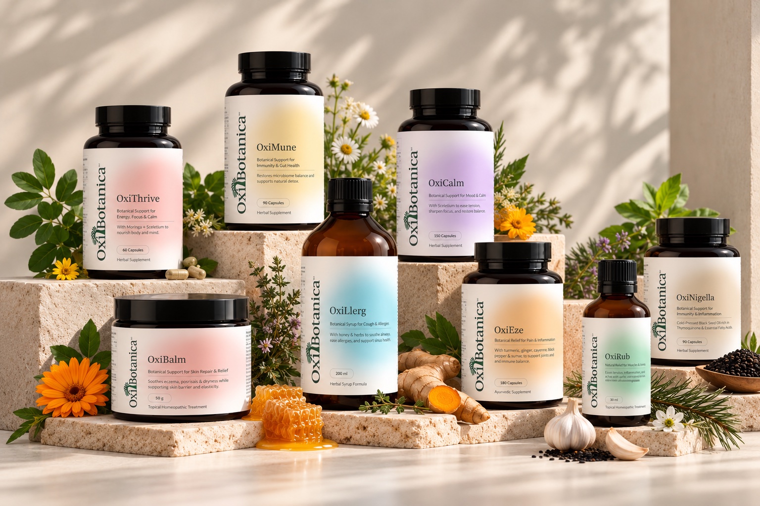
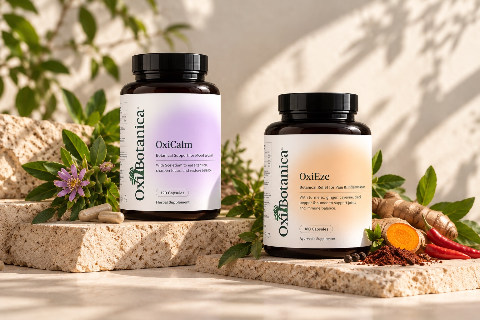
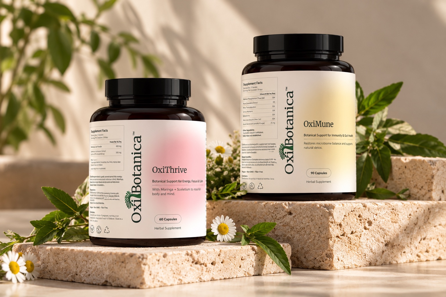
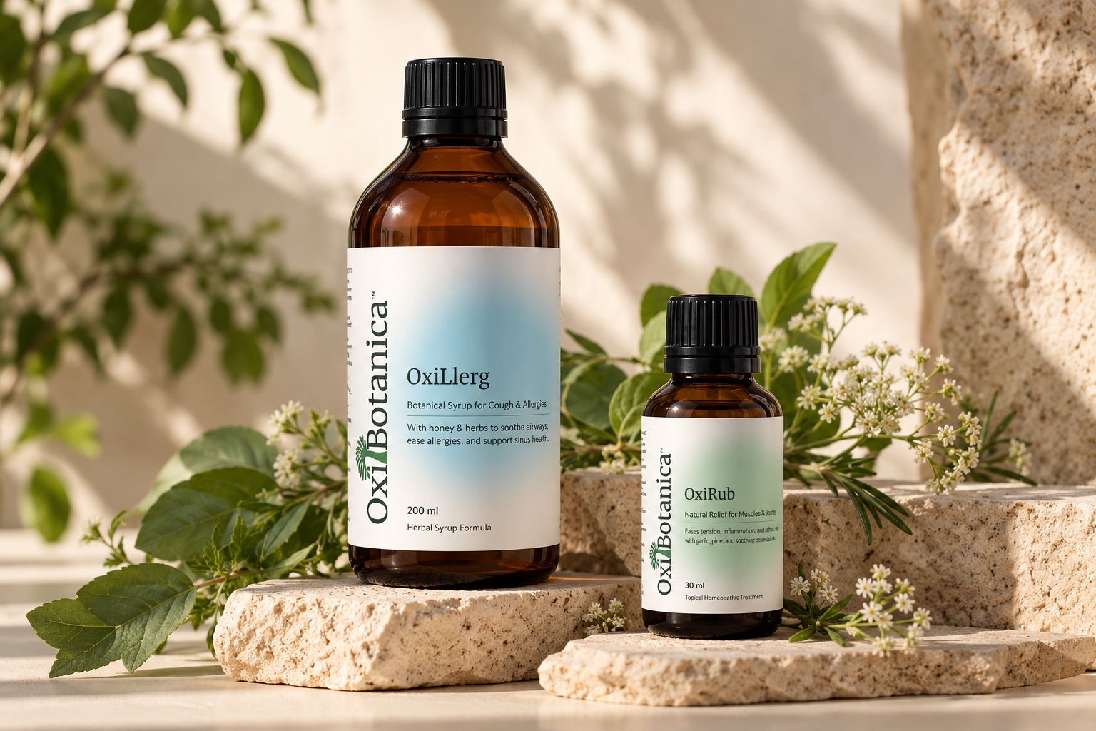
As more products got added, consistency became the real problem to solve. Instead of designing every label from scratch, we built a flexible system — same layout, same typography, colour doing the work of telling formulations apart at a glance.
That's what keeps the range feeling cohesive now, and it's also what makes it easy to add the next product without starting over.
Extending the brand online.
Once the identity was in place, the website became a natural next step. We didn't want it to feel like just another supplement store — the goal was calm, educational, and easy to navigate, giving visitors the philosophy behind the products before asking them to buy anything.
The same visual language carries through the whole experience, so the brand, packaging and digital touchpoints all feel like one thing.
Natural Wellness & Herbal Supplements by OxiBotanica.
Where science meets soul, and wellness becomes personal.
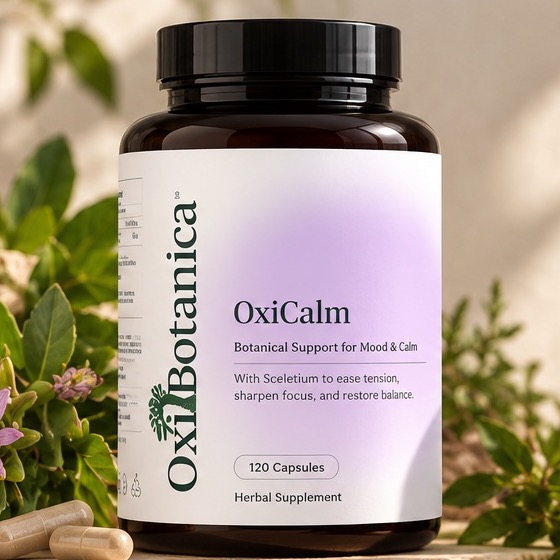
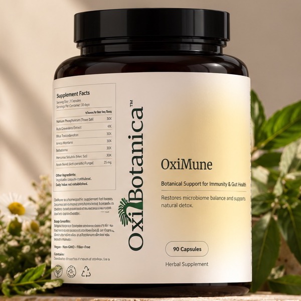
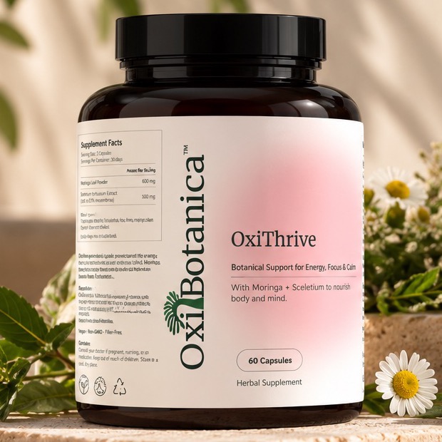
Explore remedies rooted in nature, made for you.
CalmOxiCalmImmunityOxiMuneEnergyOxiThrive←♡OxiCalm
Before meals, or 20 minutes after meals.
More than a logo.
The project started as a logo and ended as a brand ready to sell: a name, an identity, a range that grows without a redesign, and a live site. Every decision, from naming to packaging, was made with the founders, not for them.
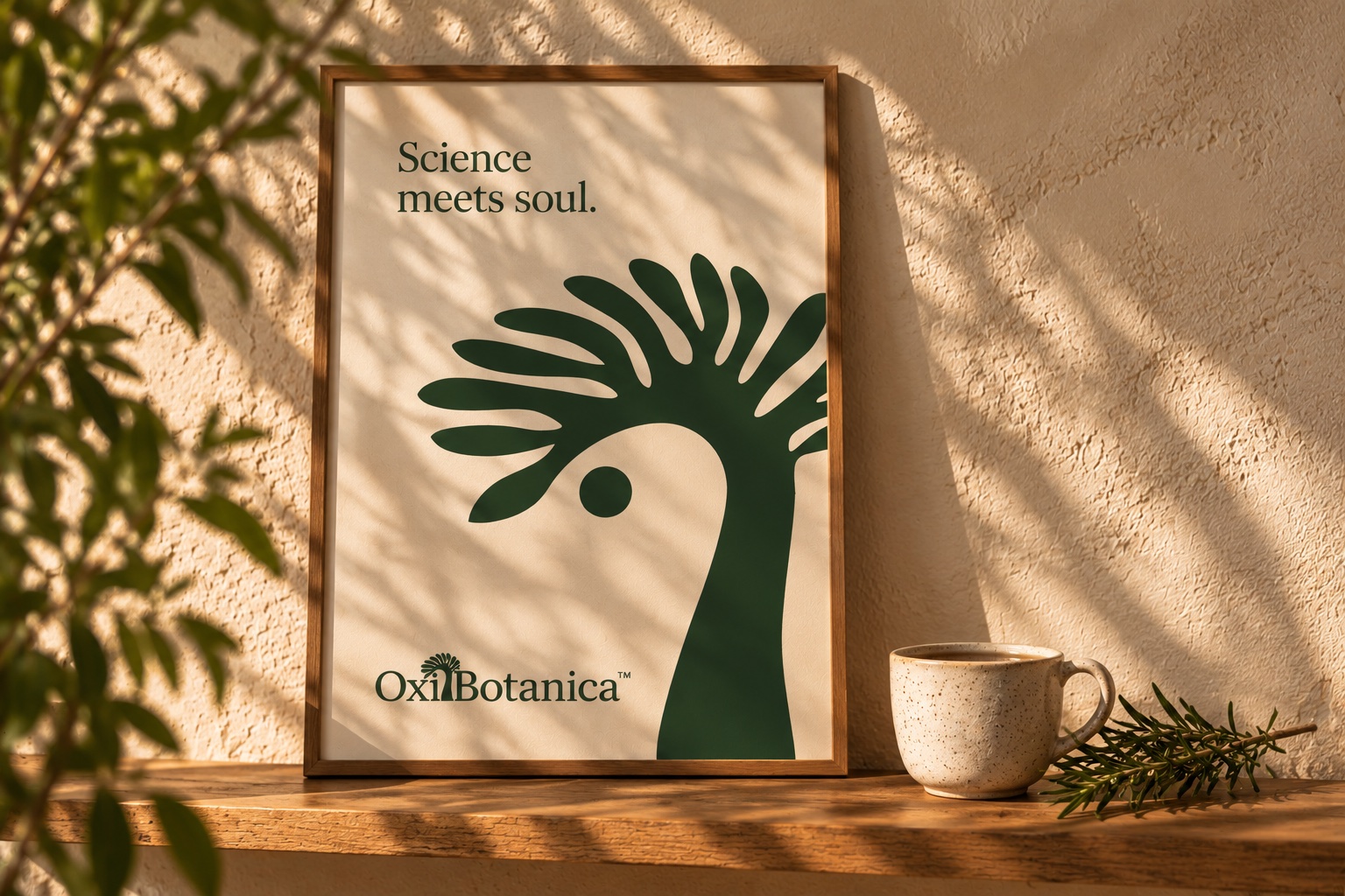
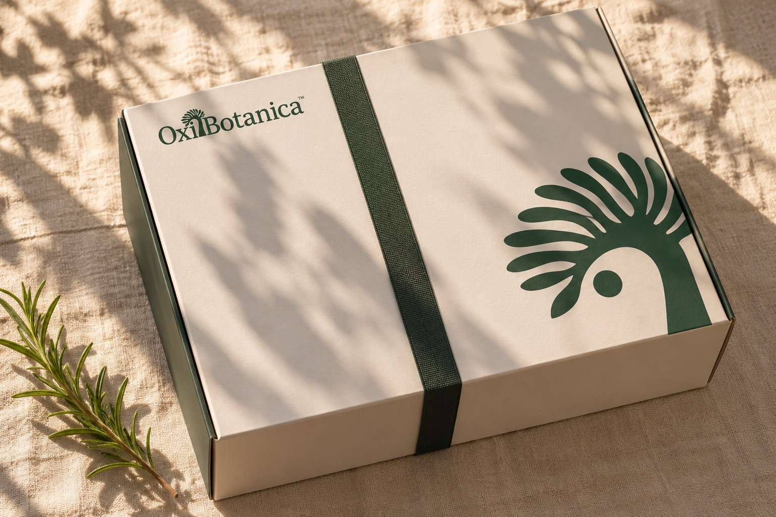
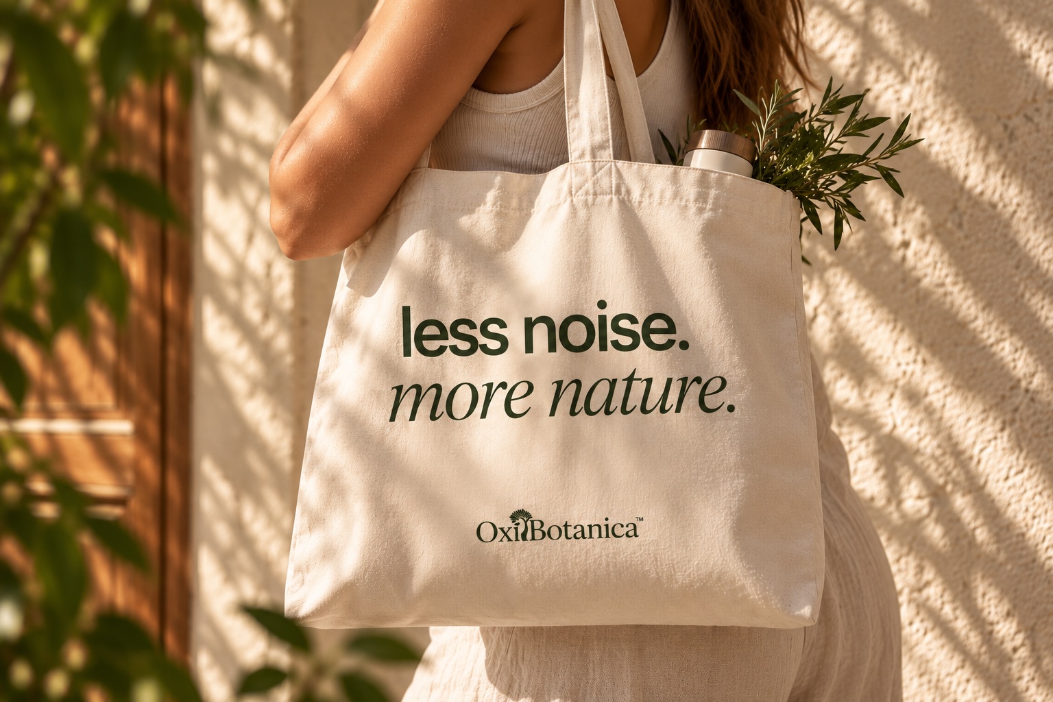
Social posts
OxiBotanica — Brand identity & packaging
Back to work