Building a visual identity for an early-stage AI automation startup.
ITEM8.ai approached us during the company's early stages with a simple goal: create a brand that makes automation feel clear, approachable and trustworthy.
Working closely with the founders, we developed the visual identity, brand guidelines, website and Webflow implementation, creating a scalable system the business could grow with.
Building a brand while the business was taking shape.
As an early-stage startup, many product and messaging decisions were still evolving. Working directly with two technical founders, we explored ideas collaboratively through regular brainstorming sessions, iterating quickly as both the business and the identity developed together.
The challenge wasn't simply designing a logo. It was creating a visual language that made automation feel structured, approachable and dependable without relying on the typical AI aesthetic.
Exploring the identity through the number eight.
The company name evolved throughout the project, which meant the logo evolved alongside it. We explored different naming conventions, lockups and symbolic directions — from expressive icon concepts to purely typographic solutions.
Many ideas gave the "8" too much visual weight, turning it into a standalone symbol. The final identity intentionally pulls back, allowing the 8 to create recognition while remaining part of a clean, confident wordmark.
”ITEM8 sounds like automate — so the became the favicon.
Finding the right personality before designing the system.
Rather than choosing a typeface based on aesthetics alone, each candidate was evaluated inside realistic homepage layouts. This made it possible to compare not only readability, but also the overall personality each combination brought to the brand — from technical and enterprise-focused to approachable and product-led.
The final pairing — Comfortaa for display, Open Sans for body — balanced personality with usability, giving the brand a distinctive voice while remaining highly readable across digital products.
Each tested in the homepage hero
Your Business, Fully Automated — Without the Chaos
From sales to HR to ops, we design and build the systems that run your business — so you can focus on growth, not glue.
Help me automateSee real resultsFinal pairing
Extending the identity into a digital experience.
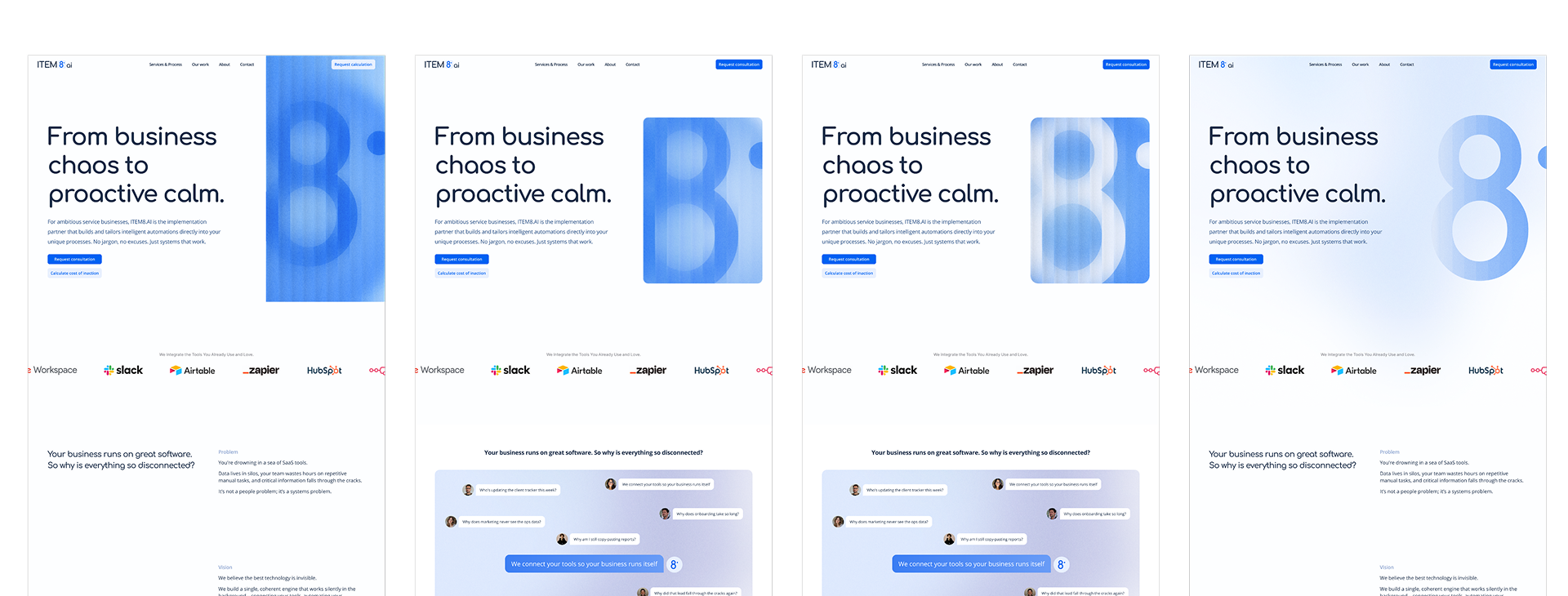
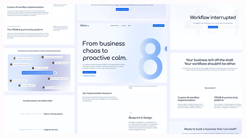
Once the visual foundations were established, the focus shifted to the website. Several homepage directions explored different ways of integrating the "8" into the experience — not simply as a logo, but as a recurring graphic element that adds recognition without distracting from the content.
Throughout the exploration, the priorities stayed consistent: generous whitespace, clear messaging, and a navigation system that made a technical service feel calm rather than sterile or overhyped — the two failure modes most AI brands fall into.
A system that scales.
The identity extends naturally beyond the website into marketing materials, presentations, social assets and printed collateral — every touchpoint following the same principles: consistent typography, restrained colour, and a graphic language built around the "8."
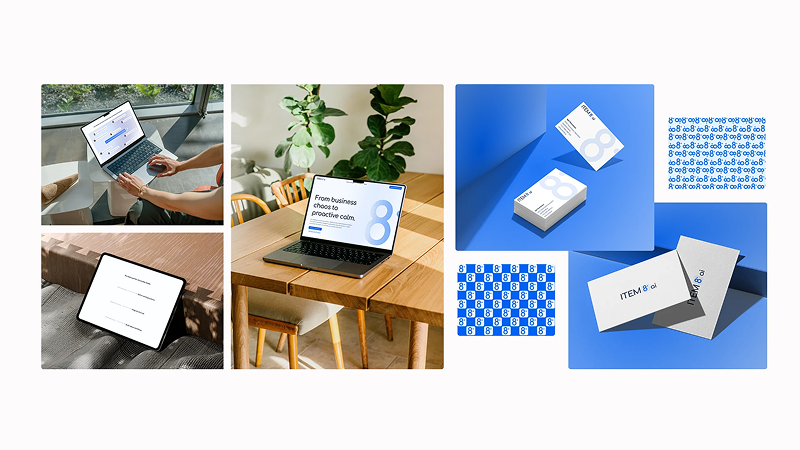
A foundation built for growth.
The project resulted in a complete visual identity and digital presence that gave ITEM8.ai a professional foundation from its earliest stages. By deliberately avoiding the neon-gradient, circuit-board default of most AI branding, the system reads as calm and dependable — which, for a company selling trust in automation, was the whole point.
- Brand identity
- Logo system
- Typography & colour palette
- Brand guidelines
- Website design
- Webflow development
- Social media assets
- Marketing collateral
ITEM8.ai — Brand identity & website
Back to work