Designing a visual language for scheduled private aviation.
Hoply isn't selling an aircraft — it's selling a network: recurring schedules, direct routes, and a predictable way to move across Europe. The identity had to say that, in a category where almost every competitor says the opposite.
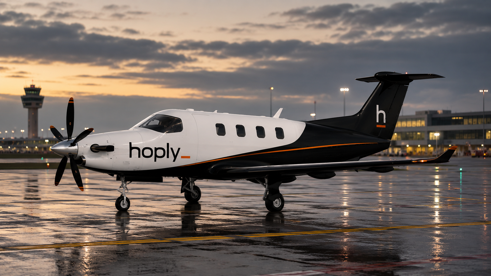
Hoply runs a scheduled private aviation network across Europe — recurring routes, not one-off charters.
The identity had to communicate that structural difference, in a category built entirely around the opposite promise.
a deadline, and a category full of the same look.
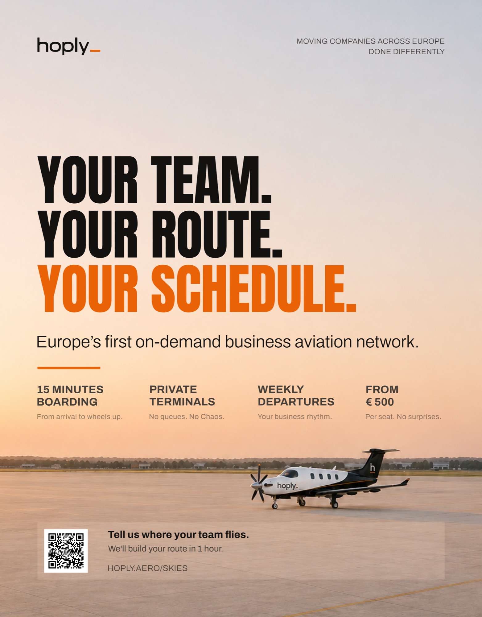
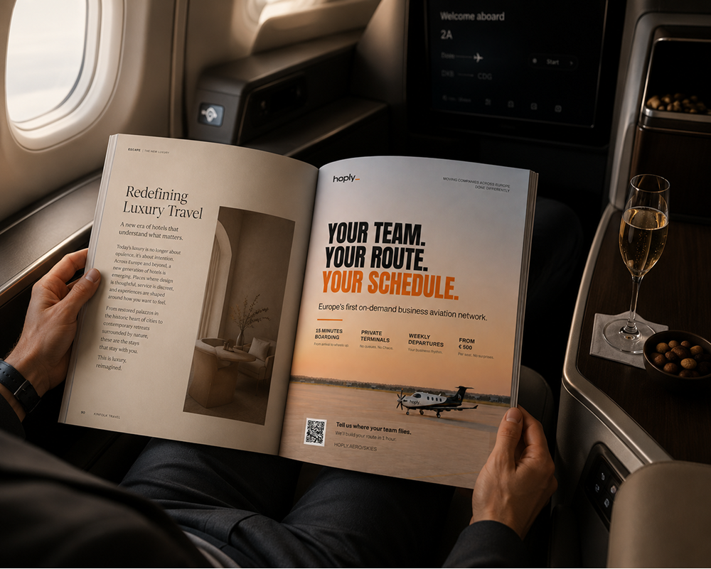
The project arrived with a fixed print deadline: a full-page ad, ready for a premium in-flight magazine distributed through long-haul and regional airports across Europe. No time to iterate slowly — colours, type and a printable poster had to exist fast, and hold up at 300dpi on a page that would sit next to genuine luxury brands.
Private aviation identities tend to reach for the same moves:
None of it communicates what the product actually is. And with generic AI tools now producing that exact look for anyone who asks, leaning on it would have made Hoply instantly forgettable in a category that already forgets fast. The brief became: build something a prompt couldn't — grounded in the product's real mechanics, not aviation mood-boarding.
before the mark, options.
Case, weight, and whether the brand needed an icon at all were tested before landing on the wordmark alone — lowercase read direct and confident, capitalised felt like a legacy carrier, and a companion mark diluted more than it reinforced. The simplest version won.
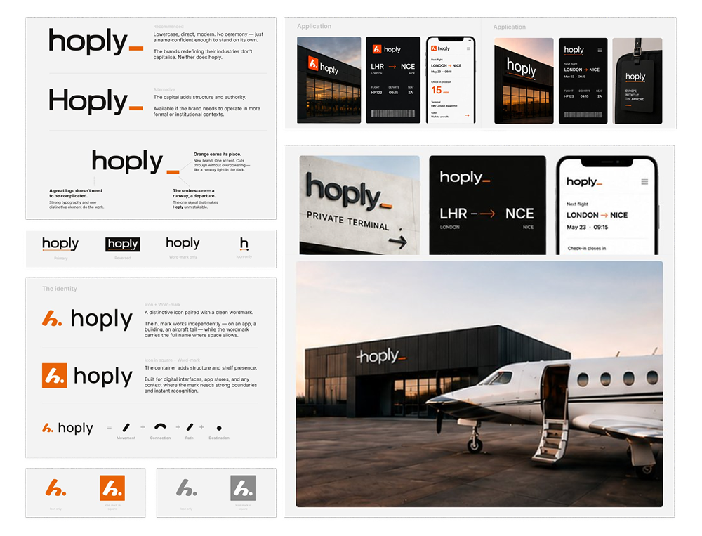
the underscore does double duty.
The bar under the wordmark reads two ways at once — a blinking text cursor, and a runway centerline. It's not decoration: it became the seed for the entire graphic system, resurfacing later as a recurring marker of movement across every application.

Custom letterforms
Rooted in Anton, but not left as-is. Each character in "hoply" was redrawn by hand for more character — while staying close enough to the family to feel like one system.
Bar weight
Thickness tuned to match the stroke weight of the "o," and its width aligned to the "l" — small ratios that keep the mark feeling drawn, not templated.
Consistent weights
Every letterform in the wordmark carries identical stroke weight — no accidental variation between characters.
”We stopped designing around the aircraft and started designing around the network.
from aircraft to network.
Instead of asking how to make private aviation look premium, the question became how to visualise movement — schedules, routes, a European network, predictable departure and arrival. That shift moved the design language away from the aircraft itself and toward geography: nodes, lines, timing, infrastructure.
Our
network
A connected system across Europe's key business cities. More routes. More flexibility. Same experience.
Explore the networkpatterns that come from the runway, not the mood board.
Rather than inventing abstract decoration, every pattern was pulled from something that already exists in aviation infrastructure — so the graphics feel inevitable rather than applied. Three directions were explored before the underscore system was chosen as the throughline.
Tarmac geometry
Runway markings, centerline dashes, taxiway and apron layouts as decorative rhythm.
Route network
City nodes and recurring European flight paths mapped as an ambient background motif.
Underscore system
The wordmark's bar, extended — the direction chosen to carry the full identity forward.
warm, not corporate.
A palette built to feel premium and human rather than clinical. Orange isn't a decorative accent here — it has a job: it marks interaction, movement, routes and emphasis, and nothing else. The near-black and warm cream do the quiet work of keeping the brand out of "aviation navy" territory.
Warm cream
#F9F5F2Base — keeps the brand human, not clinical
Near black
#141210Structure, print backgrounds
Deep orange
#D95A00Interaction, movement, routes — never plain decoration
Dark brown
#312B21Supporting text, warmth against black
two fonts, each with a fixed job.
Anton is built for speed — bold enough to read at a glance, moving as fast as the aircraft it represents. Inter handles everything precise: schedules, routes, data — legible, never loud.
headlines
phase one done, the platform is next.
Colour & type system
Finalised and locked for all applications.
Print poster
Delivered to deadline for Private Skies magazine.
Website direction
In progress — carrying the network idea from print into an interactive experience.
from cockpit to page.
Hoply — Brand identity
Back to work