Buildout
Simulation-driven venture assessment — brand and identity system, 2025
Buildout is a simulation-based assessment tool that evaluates real decision-making under uncertainty.
We designed a system-led identity that reflects its role as a serious diagnostic product, not a promotional brand.
The product launched as Frames & Games. Early in the project, our brand strategy partner recommended a rename — the name no longer covered everything the product actually does. Buildout was the result, and the identity was built around it.
Buildout operates in a space crowded with performative hiring tools and personality-driven assessments.
The challenge was to create a brand that felt serious and objective without becoming cold or corporate — while keeping clarity under complexity.
- Avoid HR aesthetics
- Avoid hype
- Build a scalable system

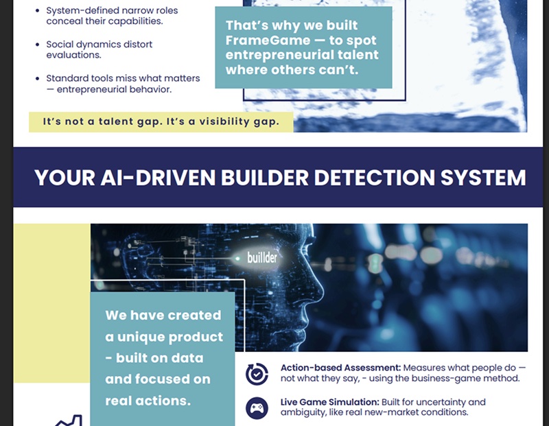
”The goal was to make the identity feel calm and structured — supporting decisions, not competing for attention.
We explored minimal logo directions built around clarity, structure, and neutrality — testing how far the identity could be reduced while staying precise and system-led, including case variations to understand tone and readability.
Together with the client and brand strategist, we narrowed it down to two: the inner square and the full stop. The full stop read as an ending; the square read as a building block — a single unit to build out from. That extra meaning made the decision.
- The square — one unit, the smallest building block. The rest of the system is built from it: grids, tiles, data.
- The offset — the founder wanted colour, so we added a layer instead of a new shape. A violet block sits just behind, like the next piece being placed, adding depth and a sense of progress.
- The wordmark — lowercase and geometric, so it reads grounded and approachable rather than corporate.
- The favicon — at 16px the wordmark disappears, so the mark reduces to its essentials: the square and the "b".


We explored multiple color directions to test how tone influenced trust, clarity, and distinction.
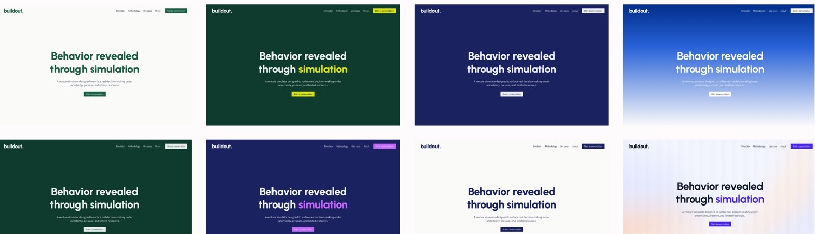
The final palette combines structured violets with warm accents to keep the system clear, calm, and approachable.
Signal Violet
#4925EBField Violet
#C3CDFFMist Violet
#E2E6FFMomentum Orange
#F4994AEmber Light
#FFD2B1Surface Ember
#FFE8D8Core Ink
#0F172AData Slate
#475569Base Canvas
#FFFFFFWe tested a few typographic directions before settling on a pairing:
- Urbanist + DM Sans — a clear split between brand and system text
- DM Sans only — neutral and familiar, with hierarchy from weight alone
- Figtree + DM Sans — warmer and more approachable
Urbanist + Source Sans 3 proved the strongest and most scalable. Urbanist brings confidence at bold weights for headlines and brand moments; Source Sans 3 stays neutral and legible across dense, UI-like layouts.
Enough character in the brand layer, maximum clarity in the functional layer.
On the website, the square becomes the system — it builds out into grids that highlight, merge and turn into data. Violet is held back for the one thing that matters on each screen: a key phrase, a label, a result.
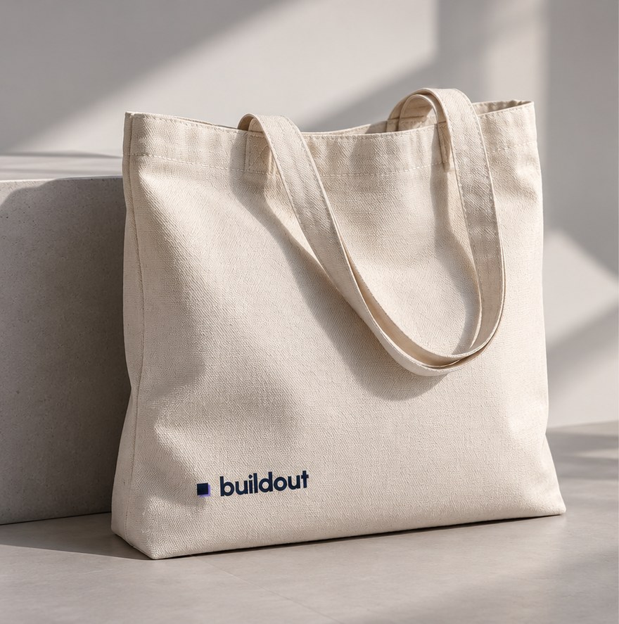
How the identity could carry across touchpoints — from outdoor signage to business cards — legible and consistent at every scale.
London, UK
+44 20 7946 0123
London, UK
+44 20 7946 0123
London, UK
+44 20 7946 0123
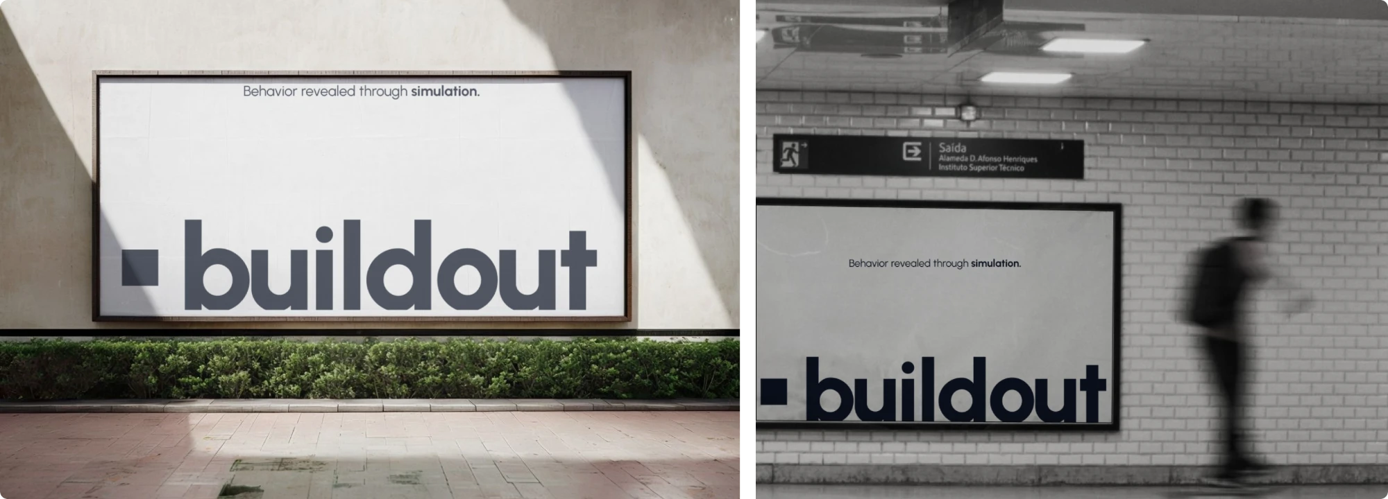
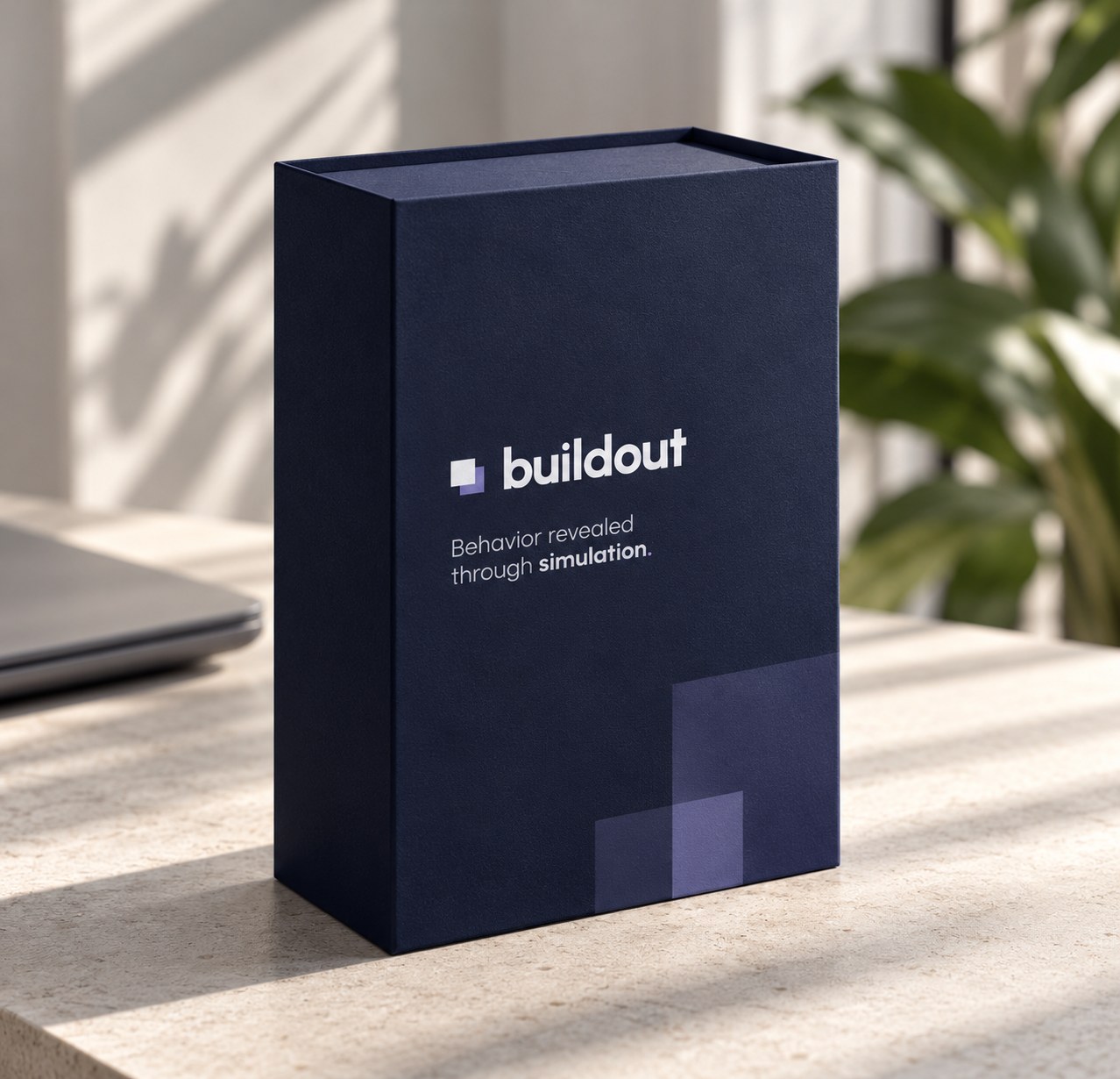
Turned an inconsistent visual direction into a cohesive system
Added structure and clarity across brand and product
Created a look that stands out while staying calm
Built a scalable foundation for future growth
Buildout — Brand strategy & identity
Back to work